Apple + How To + Software & Apps
How to use Dark Mode in macOS Mojave
Posted on
by
Kirk McElhearn
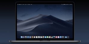
Dark mode is one of the most visible new features in macOS Mojave, and is the most radical change to the interface of Apple’s operating systems since the advent of Mac OS X in 2001. This setting allows you turn most of what you see into a sort of negative view: instead of black text on a white or gray background, you see gray text on a black (actually, dark gray in most places) background. Windows, menus, toolbars – everything shifts (though there are some elements that don’t change; see below).
Dark mode is not for everyone. Reading white text on a dark background can be difficult for many people, notably those with astigmatism. But some people love working like this; it’s a lot more restrained than the standard interface; there is less light to assail you. It is especially good for working late at night which is probably why many developers tend to favor this mode.
There were already some Apple apps that had a dark mode interface either fully or in certain areas. The Photos app has a light interface when you browse your photos, but when you switch to edit mode it’s dark. This prevents distractions by the light around your photos when editing them. Logic Pro also has a dark interface; this may be because recording studios often have low light and engineers need to be able to see without being blinded by bright displays.
Turning on dark mode in Mojave is simple. Go to System Preferences > General, and click Dark next to Appearance.
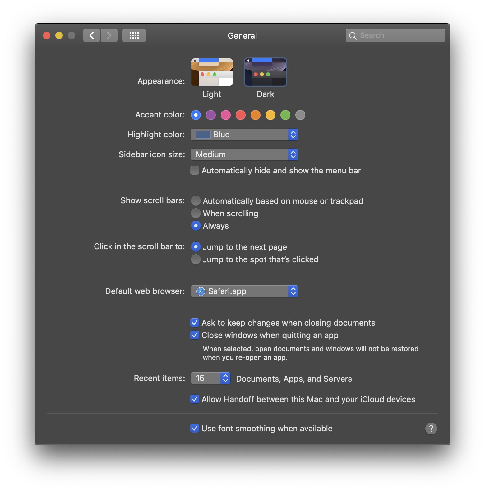
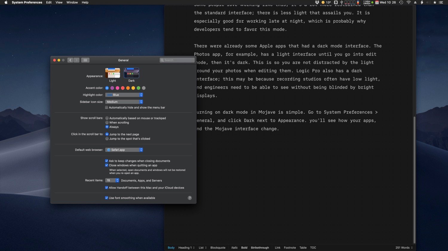
Dark mode is not black; as you can see below, the text editor I’m writing in is very dark but the System Preferences window is a dark gray, quite far from black. Full black would actually be disturbing. With reflective displays it would look almost like lacquer and would be much harder for most people to read.
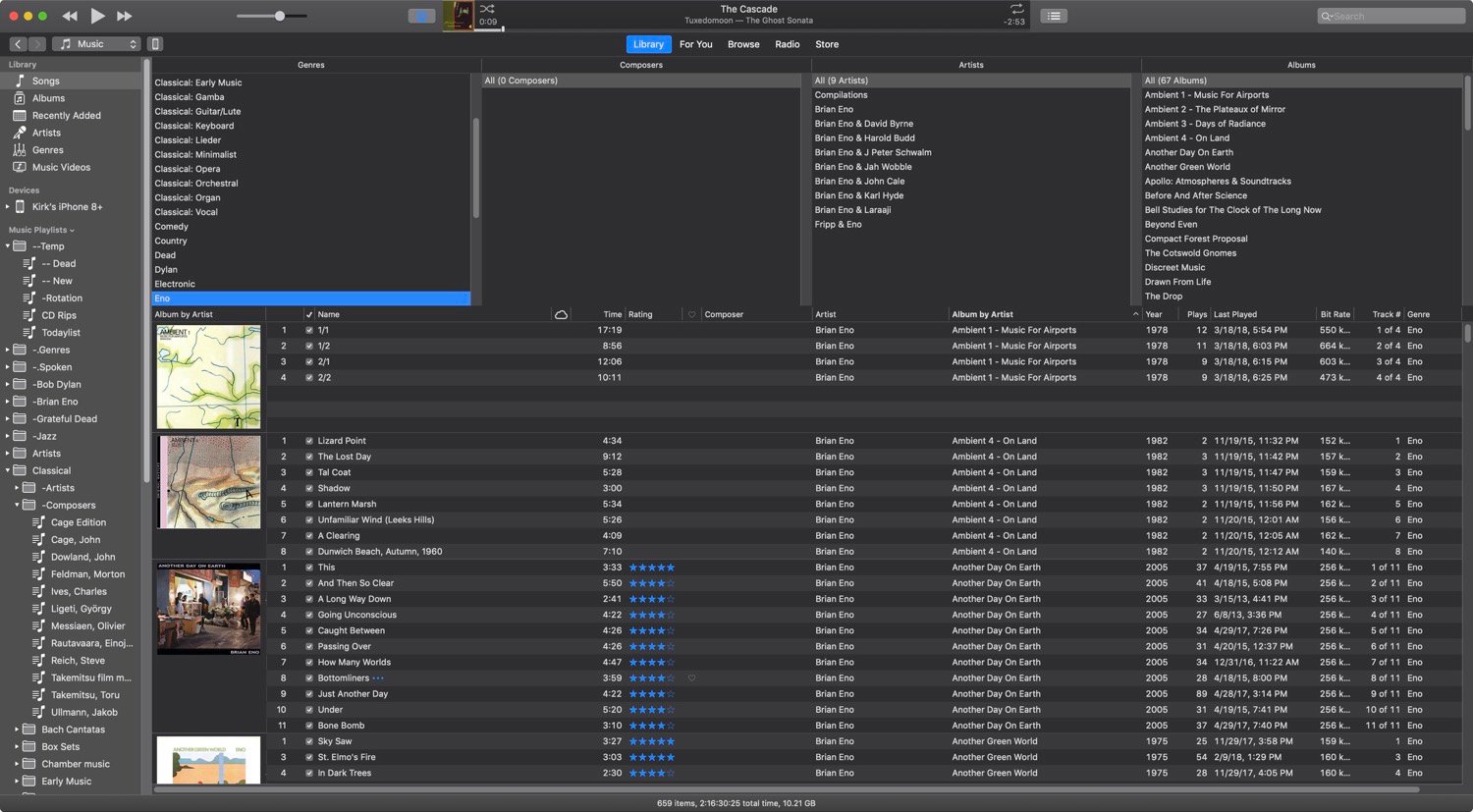
Working comfortably in dark mode isn’t just a question of flipping a switch. Developers need to consider shading different interface elements to make the display useable. It isn’t ideal for all apps. For example, in Songs view in iTunes, the alternating shaded / not shaded rows, differently shaded sidebar, and blue stars and highlights are quite distracting.
Some apps are not yet optimized or only work partially in dark mode. For example, if you use Microsoft Office for Mac, none of the apps offer a dark mode. TextEdit, the text editor included in macOS, shows a white window with black toolbars. Apple’s news app combines dark and light, though the news shown in Apple’s Stocks app does take on a dark mode interface.
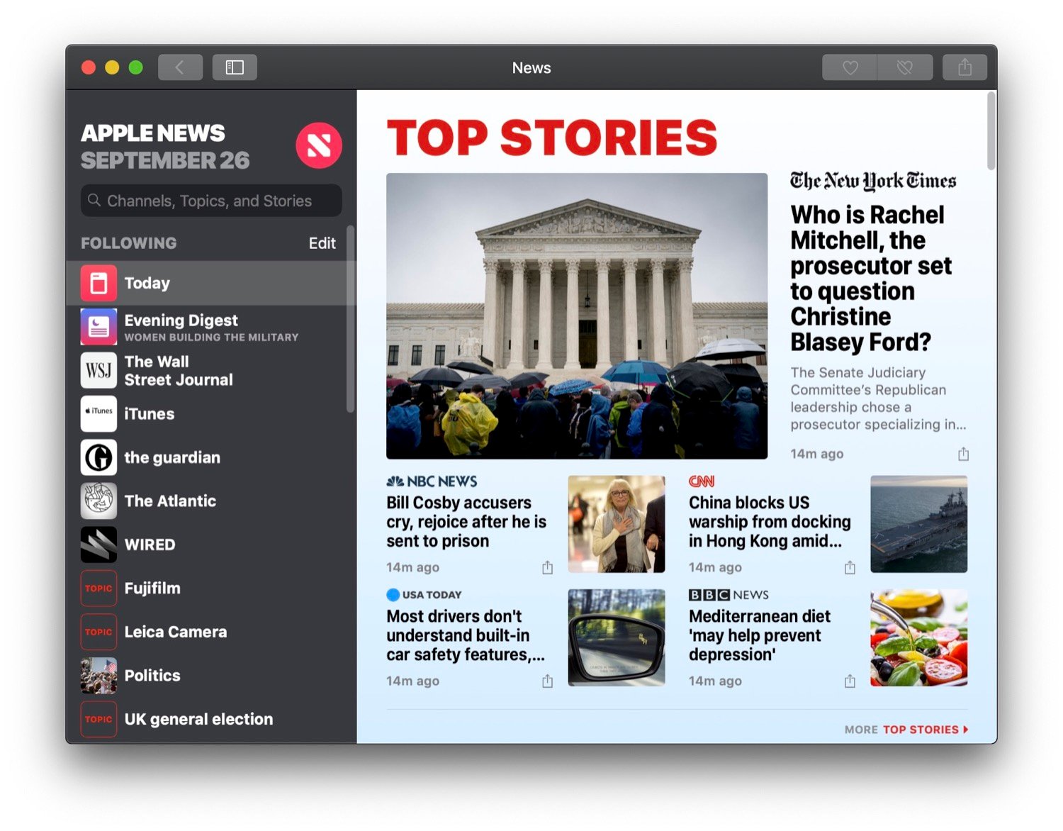
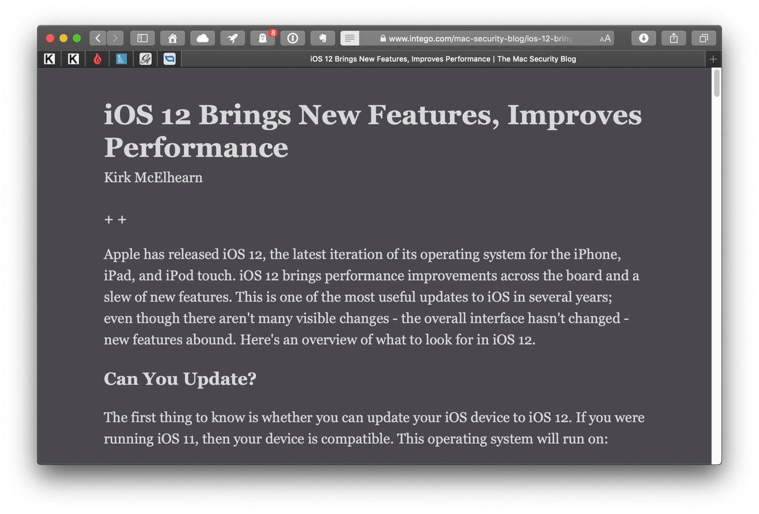
Web browsers are particularly problematic because of the content they display. In a web browser, while interface elements become dark, pages are not designed for this mode so you will see your entire Mac’s interface in dark mode, but bright white pages in your web browser. (Don’t expect many websites to offer a dark mode option.) One way to get around this is to use Reader mode; on a web page that is compatible with Reader, click the small icon at the left of the address bar (the four horizontal lines). This converts the display to show only text and graphics, removing many of the extraneous elements on a page, and when you’re in dark mode, this defaults to a gray background. (Click the AA icon at the right of the address bar to adjust this – choose from white, sepia, dark gray and black themes.)
In summary, keep in mind when you switch on dark mode not everything will be dark and the differences may be jarring. HazeOver is a third-party app that I have used for a long time to help this. It dims windows that are in the background, making them less distracting, and when in dark mode, any light windows that you’re not actively using will be dimmed; you can choose how much.
Dark mode isn’t for everyone, nor is it for every app, but you may find it useful. You might want to turn it on when you’re working in certain apps – notably not a web browser – or at certain times, such as at night. It’s just a few clicks away in System Preferences, so try it out and see if it works for you.